|
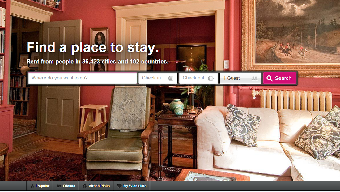
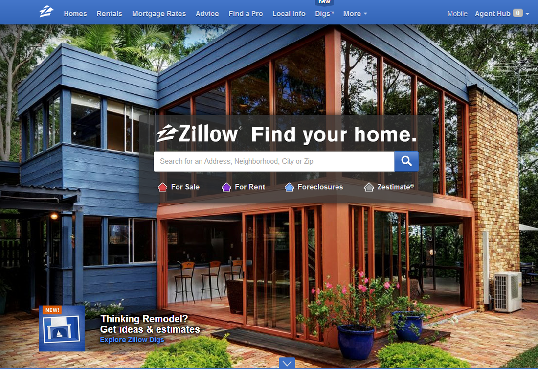
Zillow.com and airbnb.com are two powerhouse real estate websites. Their purpose is different and if you delve into the archives you see what used to be very distinct home page styles as well. But today, their look is exactly the same. The older Zillow has adopted the clean and photo-forward look of airbnb. I guess the owners of airbnb should be flattered. Really flattered. Launched in 2006, Zillow is the largest real estate advertising network on the internet. Because it offers market value and statistics of every single-family home in the country, it is often the first place people go to begin their research into home buying or selling. Airbnb on the other hand offers a new concept in guest accommodations. It made its online debut in 2008 as a platform for individuals to rent unoccupied space in their homes to guests for the short-term. Like all good website design, both airbnb and zillow have simplified their look over the years. The days of putting every piece of relevant information on the home page are gone. Today every internet visitor knows to go deep into a site to find several layers of useful information. If a website bombards them with words and other visual clutter, it is as unappealing as a home hidden by overgrown brush, refuse and excessive lawn ornaments. Who wants to open the door to a place that looks like that? The result of this evolution has been sophisticated simplification by some websites, with zillow and airbnb the established leaders. Well, actually airbnb lead the way. As stated above, zillow recently duplicated airbnb to the point you have to pause to remember on whose site you landed. For this article, I gave both zillow and airbnb one year to get their act together, and using website archives, I took a screen grab of each site one year after their launch. Then I took another grab of how they looked in February 2011, and a final grab of how they appear today. Check out the screen grabs below and and see the evolution for yourself. 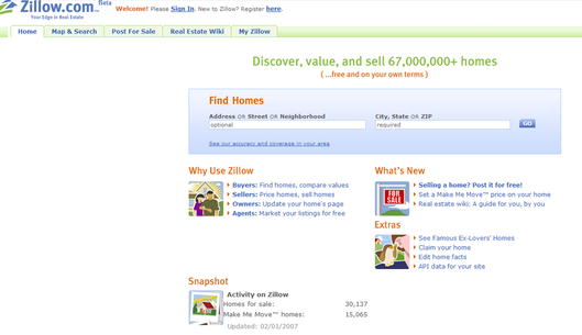 Zillow in 2007, one year after launch. No photographs, just simple but rather unsophisticated computer graphic images. And quite a few words. 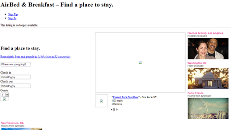 Airbnb in 2009, one year after it's debut. This grab does not do airbnb justice because the featured property photo did not survive the time machine. It could be because that particular room is no longer for rent. Notice also that the URL is not prominent. They spell out "Air Bed and Breakfast" and add a call to action: "Find a place to stay". No one would otherwise know what "airbnb" is supposed to mean. 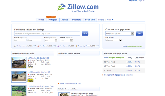 February 2011. Zillow actually added copy, not reduced it. It introduced 3 small thumbnail photos of sample properties. 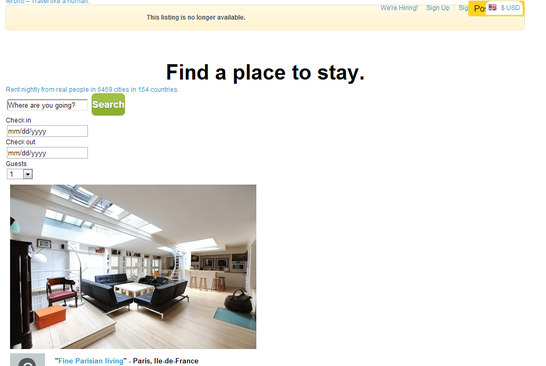 Airbnb in February 2011. Again, the URL is not featured at the top of the page. Owners wisely tell visitors to "find a place to stay". That, and the large, single professional photograph of a sample room for rent are forward web design. And here they both are today. Wait, which is which? Airbnb used this design for most of 2012 and I only noticed it on zillow this month. The archive doesn't yet house recent pages so I could not pinpoint the month when zillow became an exact replica of airbnb, but you would think they are owned by the same company! Zillow added the"call to action" feature too, commanding visitors to "find your home".
As I stated before, airbnb.com should be very, very flattered. Or should they be angry? What do you think?
1 Comment
Scott S.
3/14/2013 05:36:48 am
Style is an evolving little creature that tends to survive on replication versus trying to constantly reinvent itself. If you were to do your little test on the top 20 service websites over the last 6 years I am quite sure that the similarities of the homepages would vastly outweigh the differences, especially those of today. AirBnb didn't invent the simplified homepage with big, engaging photos - its what is (was) fashionable long before they jumped on the bandwagon. See Bing, Groupon, Living Social, Rdio, Apple, etc. etc.
Reply
Leave a Reply. |
Maureen Green
|
