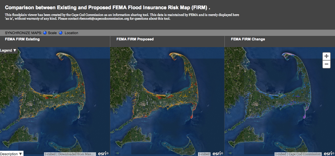
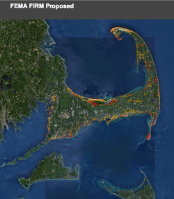
 A new web feature by the Cape Cod Commission provides the clearest look yet of what rising sea levels are doing to flood zones. That map, found here, shows three satellite photo plains, the first is existing, or "adopted" FEMA flood zones, the middle shows "proposed" flood zones, and the most unique feature of all--the third pane, shows the difference between the two. Notice the colors in the first two plains. The red area indicates high wind risk, the yellow is a flood zone. Areas not shaded in color are determined to outside a high risk area at this time. 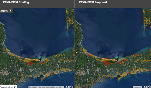 Side by side existing and proposed flood and wind zones show expansion of the high risk areas. 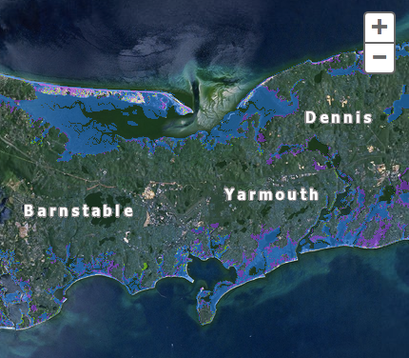 Zoom in and you can see the difference between the old flood zones in blue, and the increased flood zone in purple. 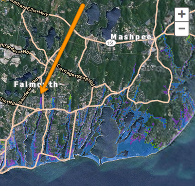 People are surprised to learn they can live several miles away from the ocean and still be in a flood zone. Note this map of Falmouth. The blue area is existing flood zone and the purple is the proposed extension. Here, the risk extends north of Route 28. Rivers, streams and marshes are at particular flood risk. The map is very user friendly, allowing you to scroll in any direction on one plain, with the other two mimicking the movement.
Be patient when zooming in to a particular neighborhood as it takes awhile for the detail to populate, but you can investigate the flood risk of any property on the Cape. When assessing your homeowner's insurance with your insurance representative, rates will be set according to the FEMA Flood Insurance Risk Map, or FIRM. Properties are categorized by various zones, and the key is as follows:
1 Comment
|
Maureen Green
|
